On this page:
- Core Brand Elements
- Utilizing the ‘H’ Brand Mark
- Harvard Shield Shape
- Instagram Branding Expansion Options
- Layout, Composition, and Grid
Core Brand Elements
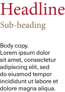
The Harvard DCE brand and its associated sub-brands are composed of fundamental brand elements, including the Harvard H extracted from the Logo Mark, the Harvard Shield Shape, and the Typography featuring the typefaces Bookmania and Neue Haas Unica. These core elements play a pivotal role in reinforcing the identity of Harvard DCE across various media platforms. While essential for brand consistency, it’s important to note that these elements need not be employed simultaneously at all times. The subsequent pages delve into detailed guidelines for their strategic and effective utilization, ensuring a cohesive and purposeful representation across diverse brand applications.


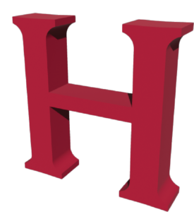
Utilizing the ‘H’ Brand Mark
The Harvard H, derived from the Logo Mark, stands as a robust core brand element, offering versatile applications to reinforce the visual brand system. Maintaining its representation in the iconic Crimson Red is pivotal, whether utilized in 2D or 3D formats. Its usage spans from its complete form to being creatively cropped, providing flexibility in visual presentations.


Examples showcasing the 2D version’s adaptability through diverse cropping, highlighting its creative potential and abstraction.
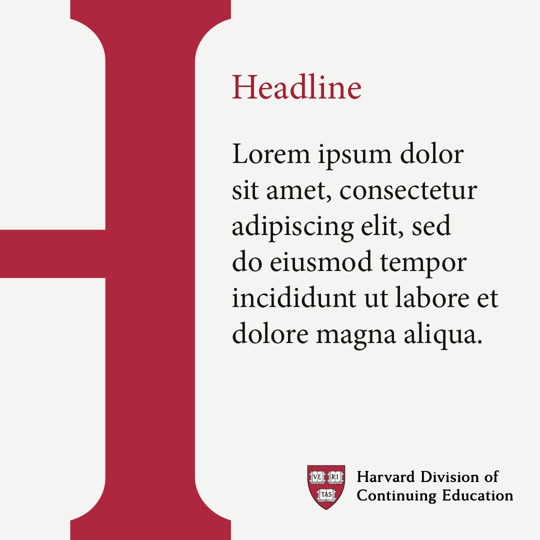

Harvard Shield Shape
The Harvard Shield shape can function as a cropping tool for photography, offering the opportunity to emphasize core brand elements when incorporating visuals. It’s designed as an optional resource, enabling the enhancement of the brand’s essence within photographic compositions without imposing a mandatory requirement for its consistent use.


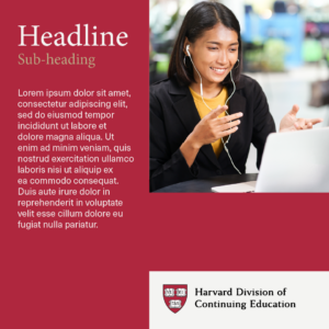
Instagram Branding Expansion Options
The Harvard H and Shield shape are ideal for scenarios where branding tends to be minimal. For instance, on platforms like Instagram, where images occupy the entire frame and can easily blend with other brands, the showcased example illustrates how utilizing the Harvard H and Shield can effectively reinforce the brand amidst such a visual environment.


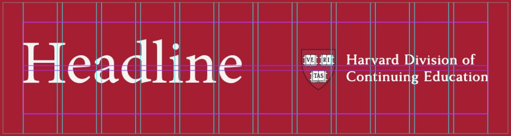
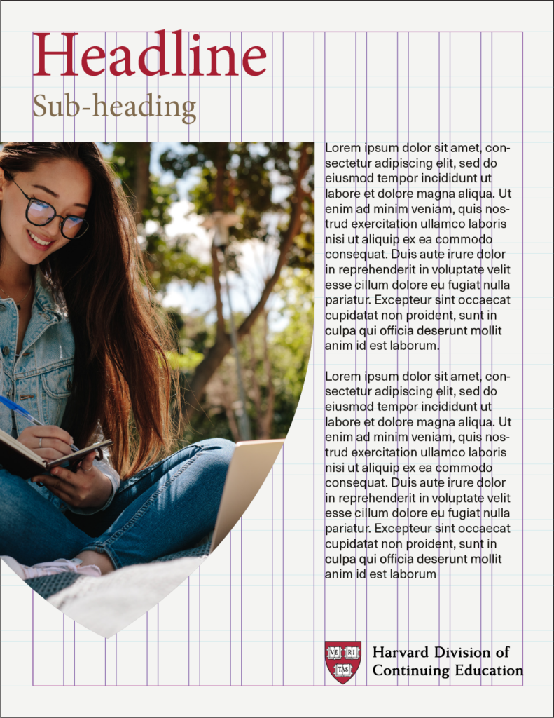
Layout, Composition and Grid
Utilizing a grid system can prove instrumental in organizing content across diverse mediums. Layouts can follow a 12-column by 12-row grid, offering flexibility and easily divisible into halves, thirds, fourths, and sixths.
This adaptability allows for a broad spectrum of layout possibilities within our visual system. For extreme vertical designs, column adjustments optimize the layout, while row modifications cater to extreme horizontal compositions. The customization of gutters and margins according to canvas size is pivotal, ensuring two key aspects: ample space for the logo within margins and well-calibrated gutters that maintain a harmonious balance in element spacing, steering clear of clutter or disjointed visuals.
See below various digital examples utilizing the flexible grid across differing formats and pixel aspect ratios.
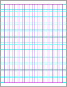
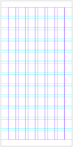
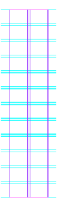
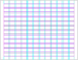
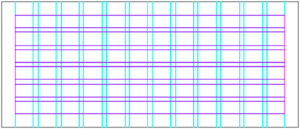
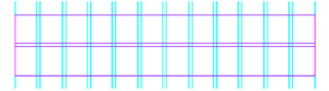
Various digital examples utilizing the flexible grid across differing formats and pixel aspect ratios.


